If you’re working with user input such as survey data, and you want to visualize how many times each string value (e.g., "Yes", "No", "Maybe") appears in your dataset, this guide will show you how to do it—even though charts only accept numeric values for their series.
Charts require numeric data to generate visual series. However, survey or similar inputs often contain repeated string values like product names, item types, or user choices. To chart how many times each choice appears, we’ll create a simple workaround.
In your table, add a new Formula column.
Set the formula value to 1.
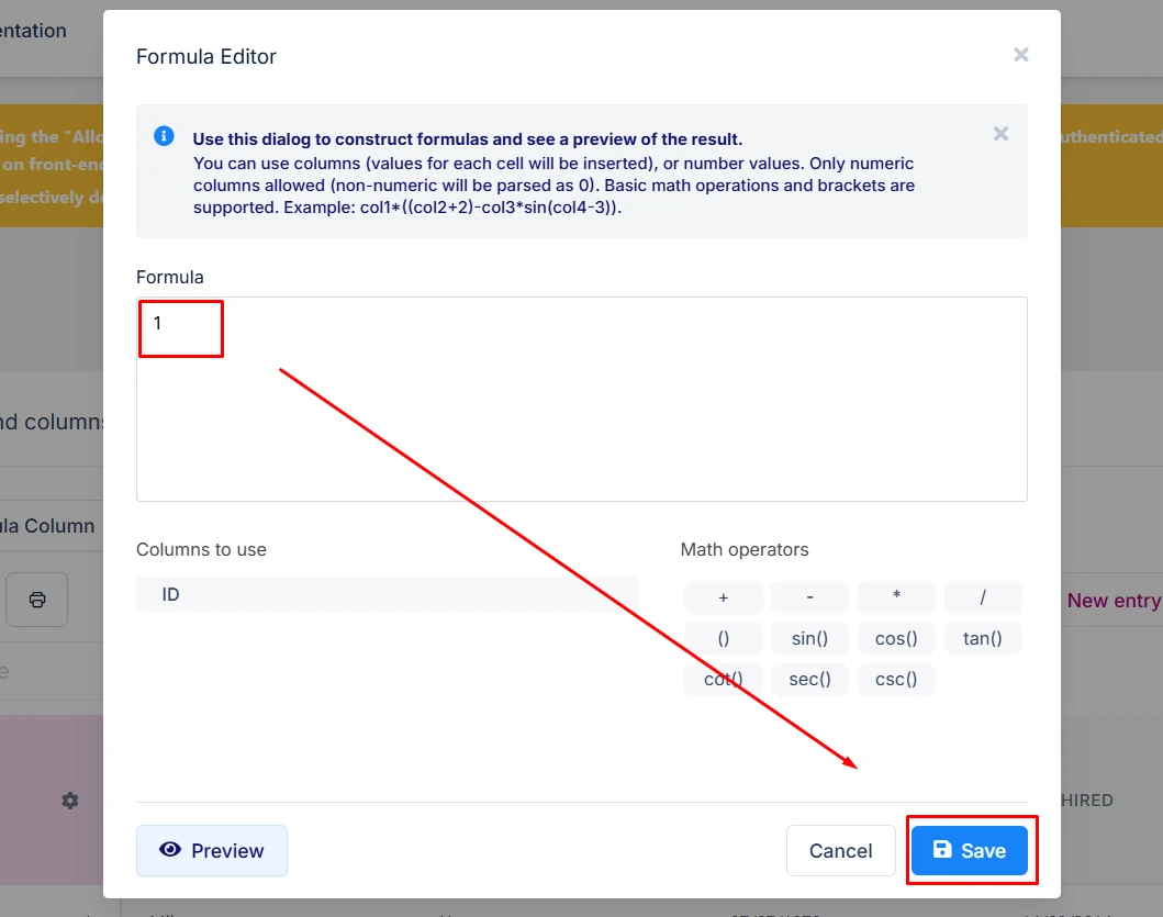
✅ This acts as the "count" that you’ll later sum in the chart.
You can hide this column from the front-end view of the source table, as it will likely be used only for this purpose.
Create a chart using your table data. Here's how to configure it:
Pick the string column (e.g., "Item Name", "Choice", "Response") as the X-axis label (first field).
Use the newly created "Count" column (numeric) as the data/series (second field).
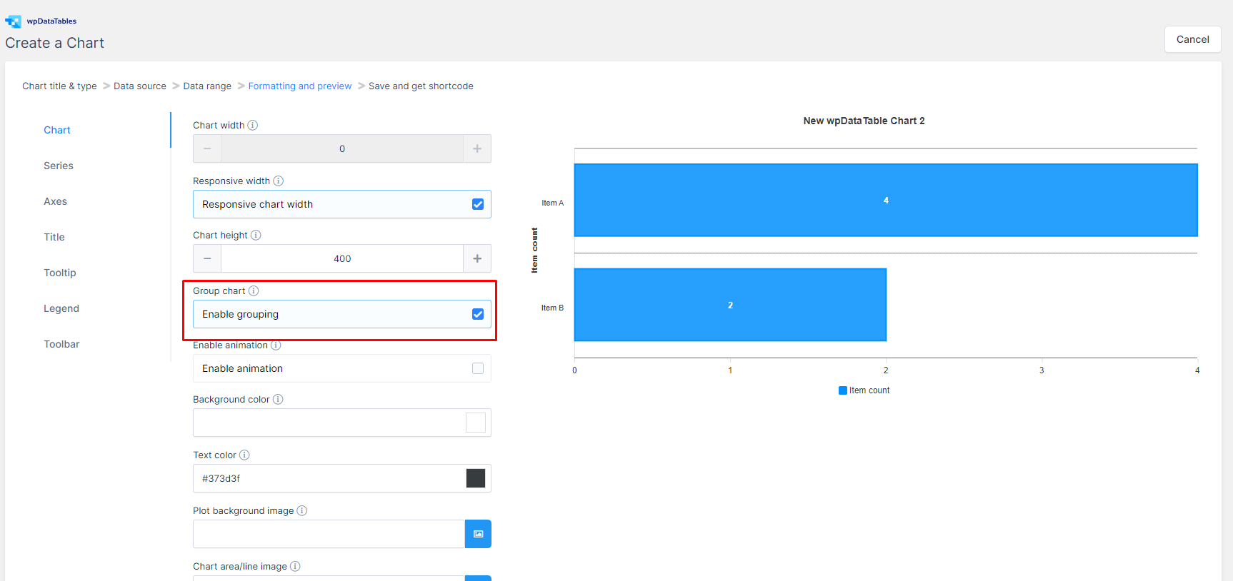
Enable the "Chart Grouping" option in the chart settings.

📊 When “Chart Grouping” is enabled, all rows with the same label will be summed up and shown as a single data point.
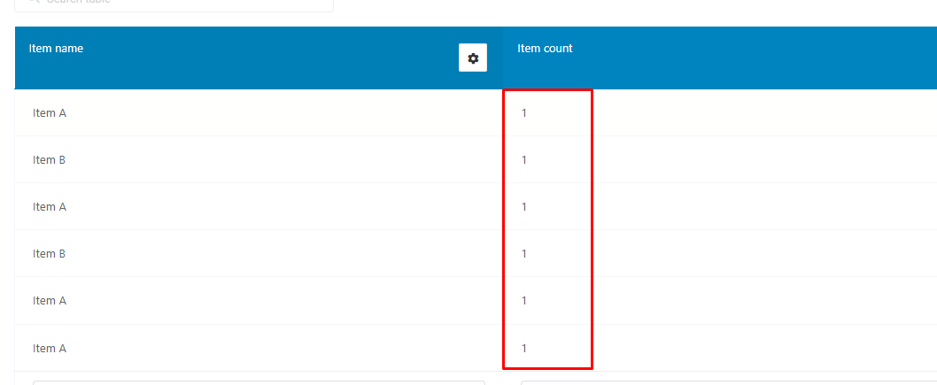
Let’s say you have a Manual (editable) table where users are entering survey responses, and one of the columns is called "Item Name".
Create a new column called "Item Count" (Integer type), and set it to always be 1.
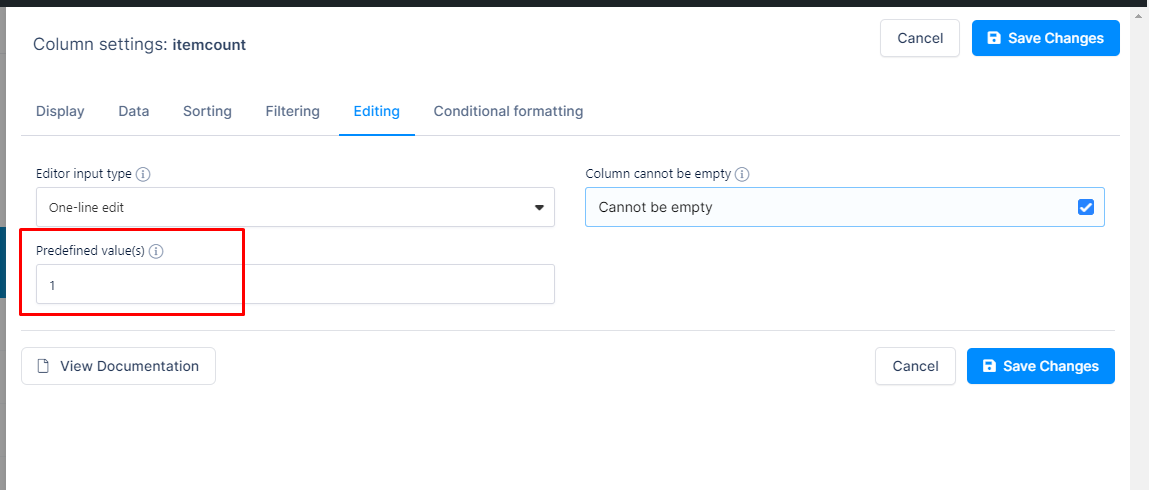
Each row will automatically record the value 1, representing one response.
💡 If you're using a Form integration, create a hidden number field on your source form and set it to auto-populate with
1for each submission.
Now, create a Bar Chart and select:
"Item Name" for the labels (X-axis)
"Item Count" for the series values (Y-axis)
Once the chart is generated with grouping enabled, it will sum up the values for each label:
Item A appears 4 times → shown as 4
Item B appears 2 times → shown as 2
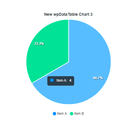
Hovering over a pie chart slice will also show a tooltip like:
"Item A – 4 (66.7%)"
This method works great with a variety of chart types, including Bar and Pie charts.