When using the built-in Responsive feature in wpDataTables, you can control which columns are visible on mobile and tablet devices. This helps keep the table clean and readable on smaller screens.
You can select a few key columns (e.g., Client and City) to remain visible, while the rest are hidden by default.
Hidden columns can still be accessed by expanding the row using the “+” button.

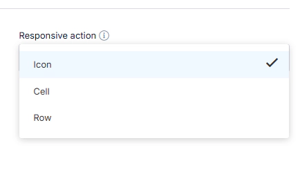
By default, rows are expanded using a small “+” icon at the beginning of each row.
However, you can change this behaviour with the Responsive Display Action setting in the table’s configuration:
Icon – Default setting; users click the “+” button to expand the row
Cell – Clicking any cell in the row expands it
Row – Clicking anywhere on the row triggers the expansion
You can find this option in the Display tab of the table settings.
Let’s say your full table looks like this:
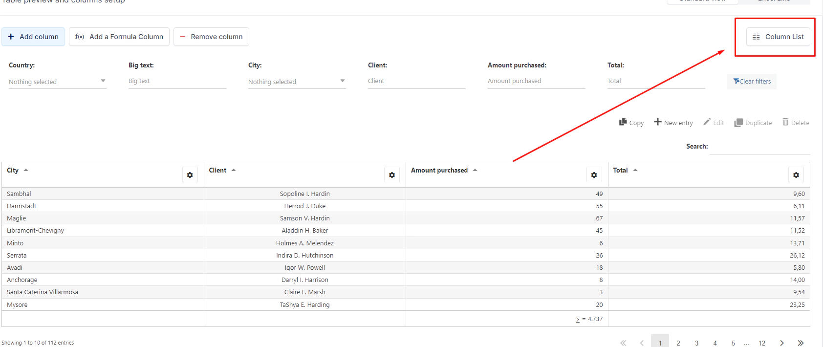
Open the Column List to configure mobile visibility:
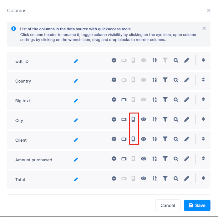
The mobile icon controls visibility on mobile screens
The tablet icon controls visibility on tablet screens
Click each icon to toggle its state:
Colored icon = column is visible
Greyed out = column is hidden on that device
For example, you might only show Client and City on mobile, and hide the rest.
Once configured, your table will look like this on a mobile device:
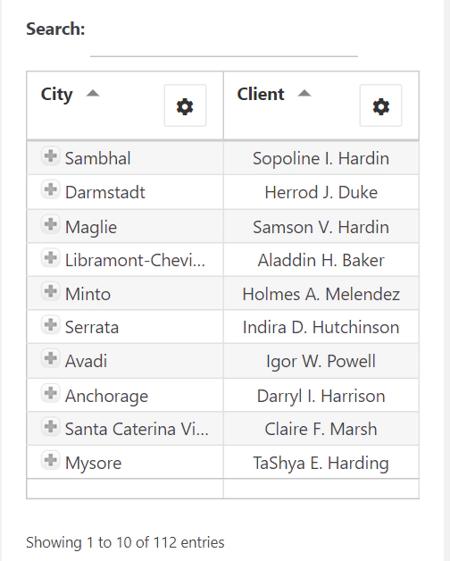
Users can expand any row to view all the hidden details, using whichever Responsive Action method you selected.
Check out our full documentation:
👉 Responsive Tables in wpDataTables