Here’s how you can set up the Responsive layout to work on all screen sizes, including desktop:
Enable responsiveness in your table’s Display settings:
You can do this by following our guide here:
👉 Responsive Tables Documentation
Choose which columns to hide on tablet-sized screens.
These columns will be hidden on the front-end but can still be revealed via the expand feature.
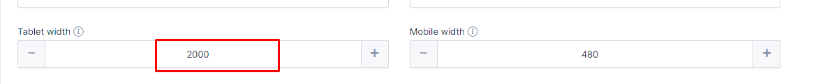
Adjust the tablet screen width threshold:
Go to wpDataTables → Settings
Increase the Tablet width value — for example, set it to 2000.
This means the plugin will now treat all screen widths below 2000px as “tablet” — effectively triggering responsive behaviour even on desktop monitors.
Once applied, a “+” icon will appear in the first column of each row.
When clicked, it will expand the row to show the hidden column data.
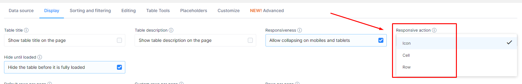
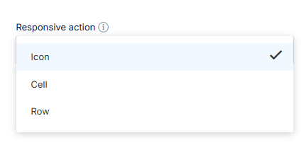
You can also control how rows expand:
On the + icon
On clicking the row
On clicking a specific cell
This behaviour is customizable in the table settings/Display tab: